앞으로 미래가 걱정돼서
프론트엔드 과정 인강을 패스트캠퍼스에서 결제했고,
열심히 듣는 중이다.
두마리 토끼 다 잡겠다는 나의 의지..*_*
앞의 html구조와 css 기초는 빠르게 듣고
바로 오버워치 예제~~~
물론 강사님과 함께 작성한 코드지만^^ 재밌었다!
[ 특이사항 정리 ]
opacity: 0.5 ->투명도
div{
width: 100px;
height: 100px;
background-color: orange;
transition: width .5s, ->가로 넓이 전환
background-color 2s; ->배경 색 전환
}
div:active{
width: 300px;
background-color: royalblue;
}
=> 클릭시 가로로 전환효과
transform: rotate(45deg);
=> 가로로 기울어짐
scale(1.3); => 1.3배 커짐
[ 완성 스크린샷 ]
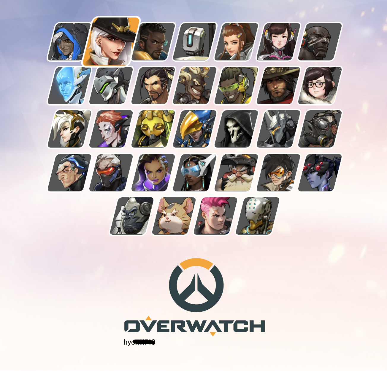
[ 깃허브 netify 연동 / 오버워치 완성 사이트 배포 ]
강사님도 이렇게 사이트를 올려놨길래, 검색해서 똑같이 올려봄!!
https://festive-murdock-1af659.netlify.app/
Overwatch
cocky-ritchie-896908.netlify.app
참고 : https://goddino.tistory.com/190
[ html 구조 ]
<!DOCTYPE html>
<html lang="ko">
<head>
    <meta charset="UTF-8">
    <meta http-equiv="X-UA-Compatible" content="IE=edge">
    <meta name="viewport" content="width=device-width, initial-scale=1.0">
    <title>Overwatch</title>
    <link rel="stylesheet" href="https://cdn.jsdelivr.net/npm/reset-css@5.0.1/reset.min.css">
    <link rel="stylesheet" href="./main.css">
</head>
<body>
    <div class="container">
        <div class="heroes">
            <!-- 하나의 캐릭터 / div 여러개 만드는 방법
              .hero*32>image (tap)-->
            <div class="hero">
                <div class="image"></div>
            </div>
            <div class="hero">
                <div class="image"></div>
            </div>
            <div class="hero">
                <div class="image"></div>
            </div>
            <div class="hero">
                <div class="image"></div>
            </div>
            <div class="hero">
                <div class="image"></div>
            </div>
            <div class="hero">
                <div class="image"></div>
            </div>
            <div class="hero">
                <div class="image"></div>
            </div>
            <div class="hero">
                <div class="image"></div>
            </div>
            <div class="hero">
                <div class="image"></div>
            </div>
            <div class="hero">
                <div class="image"></div>
            </div>
            <div class="hero">
                <div class="image"></div>
            </div>
            <div class="hero">
                <div class="image"></div>
            </div>
            <div class="hero">
                <div class="image"></div>
            </div>
            <div class="hero">
                <div class="image"></div>
            </div>
            <div class="hero">
                <div class="image"></div>
            </div>
            <div class="hero">
                <div class="image"></div>
            </div>
            <div class="hero">
                <div class="image"></div>
            </div>
            <div class="hero">
                <div class="image"></div>
            </div>
            <div class="hero">
                <div class="image"></div>
            </div>
            <div class="hero">
                <div class="image"></div>
            </div>
            <div class="hero">
                <div class="image"></div>
            </div>
            <div class="hero">
                <div class="image"></div>
            </div>
            <div class="hero">
                <div class="image"></div>
            </div>
            <div class="hero">
                <div class="image"></div>
            </div>
            <div class="hero">
                <div class="image"></div>
            </div>
            <div class="hero">
                <div class="image"></div>
            </div>
            <div class="hero">
                <div class="image"></div>
            </div>
            <div class="hero">
                <div class="image"></div>
            </div>
            <div class="hero">
                <div class="image"></div>
            </div>
            <div class="hero">
                <div class="image"></div>
            </div>
            <div class="hero">
                <div class="image"></div>
            </div>
            <div class="hero">
                <div class="image"></div>
            </div>
        </div>
    <div class="logo">
        <img src="https://raw.githubusercontent.com/ParkYoungWoong/overwatch-hero-selector-vanilla/master/images/logo_overwatch.png" alt="Overwatch">
        hy-----
    </div>
    </div>

</body>
</html>
[ CSS ]
body{
   height: 100vh;
   background-image: url("https://raw.githubusercontent.com/ParkYoungWoong/overwatch-hero-selector-vanilla/master/images/bg.jpg");
   /* 더 넓은 너비에 맞게 이미지를 출력해준다 cover */
   background-size: cover;
   /* 반복출력 사용안함 */
   background-repeat: no-repeat;
   /* 배경의 스크롤 특성 명시 */
   background-attachment: fixed;
}
.container {
    padding: 50px 0;

}
.container .heroes{
    display: flex;
    /* 줄바꿈 :wrap*/
    flex-wrap: wrap;
    justify-content: center;
    /* background-color: orange; */
    max-width: 700px;
    margin: auto;
    padding: 40px 20px;
}
.container .heroes .hero{
    width: 80px;
    height: 84px;
    margin: 4px;
    border: 3px solid #fff;
    border-radius: 10px;
    box-sizing: border-box;
    background-color: #555;
    overflow: hidden;
    /* skewX 일부 기울기 적용 각도 (-14deg) */
    transform: skewX(-14deg);
    /* 애니메이션 전상태와 후상태를 자연스럽게 만들어주는 것
     전환효과 transition */
    transition:
    transform 0.1s,
    background-color 0.6s;
}
    /* 마우스 올렸을때 변경사항 */
.container .heroes .hero:hover{
    background-color: #ff9c00;
    transform: skewX(-14deg) scale(1.3);
    /* 쌓임 순서 정리 (앞으로 꺼내기) */
    z-index: 1;
}
.container .heroes .hero .image{
    width: 140%;
    height: 100%;
    background-position: center;
    background-repeat: no-repeat;
    background-size: 90px;
    /* 부모 요소때문에 -14도로 기울여져있던 이미지를 +14 적용하면 정상이미지가 출력된다.
    translateX -> 사진이 오른쪽으로 치우쳐 있는것을 x축 16px만큼 당겨온다 */
    transform: skewX(14deg) translateX(-16px);

}
/* 첫번째 자식요소 nth-child*/
.container .heroes .hero:nth-child(1) .image{ background-image: url("https://raw.githubusercontent.com/ParkYoungWoong/overwatch-hero-selector-vanilla/master/images/hero1.png"); }
.container .heroes .hero:nth-child(2) .image{ background-image: url("https://raw.githubusercontent.com/ParkYoungWoong/overwatch-hero-selector-vanilla/master/images/hero2.png"); }
.container .heroes .hero:nth-child(3) .image{ background-image: url("https://raw.githubusercontent.com/ParkYoungWoong/overwatch-hero-selector-vanilla/master/images/hero3.png"); }
.container .heroes .hero:nth-child(4) .image{ background-image: url("https://raw.githubusercontent.com/ParkYoungWoong/overwatch-hero-selector-vanilla/master/images/hero4.png"); }
...~ 32까지

.container .logo{
    max-width: 300px;
    /* 로고 수평 중앙정렬 */
    margin: 0 auto;
    padding: 0 20px;
}
.container .logo img{
    /* 이미지의 부모 요소인 300보다는 커질 수 없어서 상대크기인 100%적용 */
    width: 100%;
}'공부 > HTML, CSS' 카테고리의 다른 글
| 2021.11.10 - 국비수업 10일차 / html,css,javascript (0) | 2021.11.10 |
|---|---|
| 2021.09.14 - 생활코딩 WEB2 / CSS 기본개념,문법,선택자 (0) | 2021.09.15 |
| 2021.09.13 - 생활코딩 WEB1 / 맥에서 아팟치 설치, HTML & Internet (0) | 2021.09.13 |

